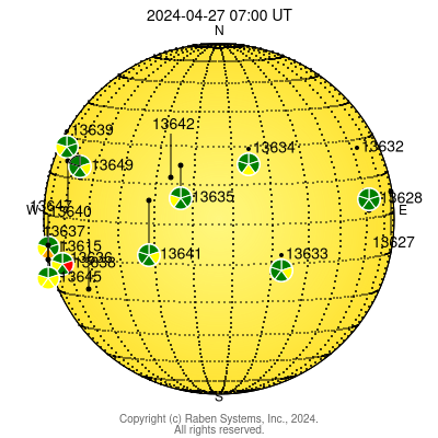
Earthside View
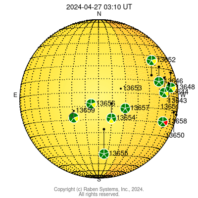
The solar map above shows the current active region numbers and locations assigned by the National Oceanic and Atmospheric Administration Space Weather Prediction Center.
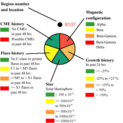
The colored circle below the active region indicates the activity level and hazard potential of an active region. See color coding used below.
If flares occur in the orange shaded area on the right side of the map, they are more likely to be directed towards Earth.
Farside View
The farside solar map shows approximate locations of regions on the far
side of the Sun (assuming a uniform solar rotation rate). Meridian
lines show days until the region might possibly re-appear on the
Earth side view of the Sun.